top of page


PORTOMUNDO
pure linen
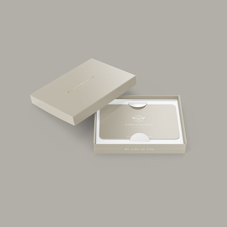
We made a re-branding for this brand that conveys warmth, formality and experience.
The isotype of the brand proposes a world and an eagle, the last one represents freedom, focus, determination, and the world represents the scope and vision of the brand.
The color palette is based on neutral colors inspired by linen, representing the formality and experience that characterizes the company. Gold accents add a tone of exclusivity and elegance to the brand. The typography is elegant and timeless.
The pattern of the brand is based on the classic reticles of the linen texture, and is applied only in details of the applications to generate a greater graphic identity.
BRAND:
PORTOMUNDO
YEAR:
2018


PURE
LINEN


bottom of page